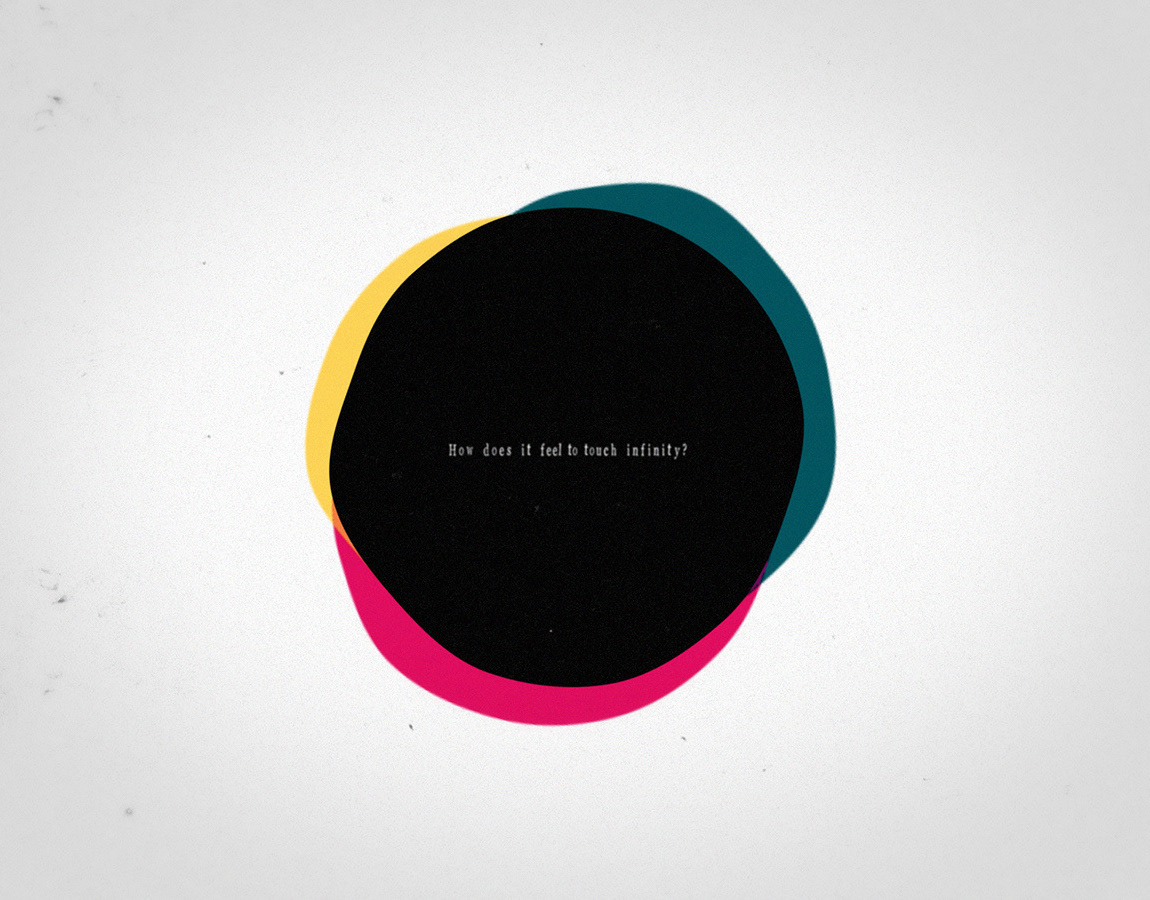
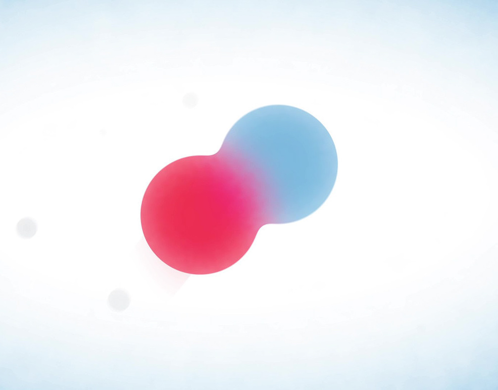
Opposites attract. So when this topic came up in our School Of Motion Alumni challenge, I was attracted, too. I'm not a big fan of using typography to name things on screen, but for this simple and abstract concept it just worked too well. I used this challenge mainly to explore different transition options and how they can work together. Adding sound design was also fun.
Since this was a contest and we shared our project files among the group, I refrained from using any 3rd party plugins or footage (apart from the audio track) and kept it fully procedural with lots of noise patterns and distortion. That way the resolution could now be 4K or higher with no quality loss.
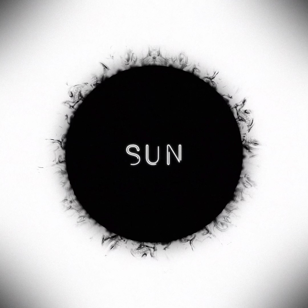
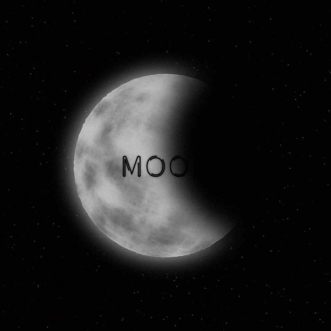
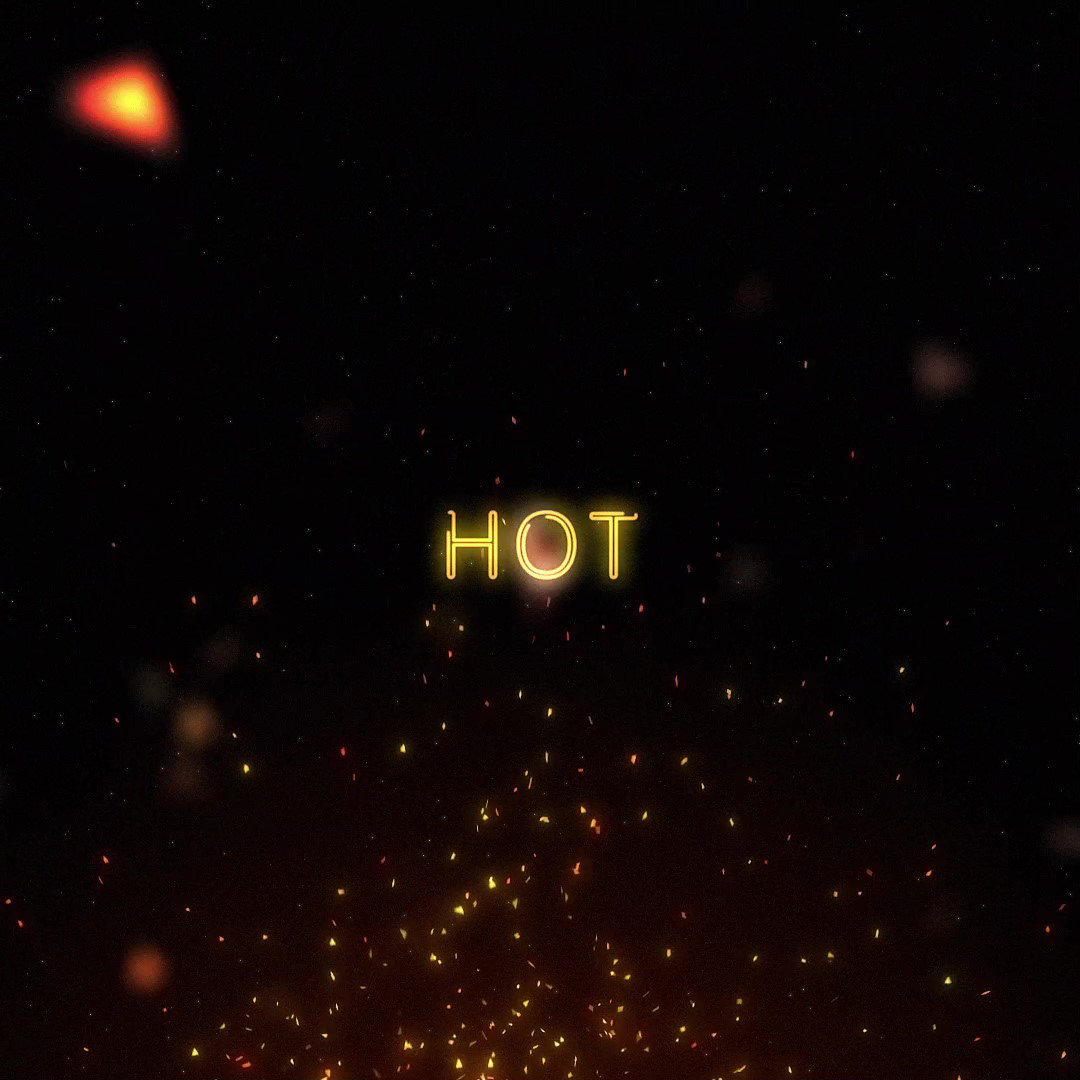
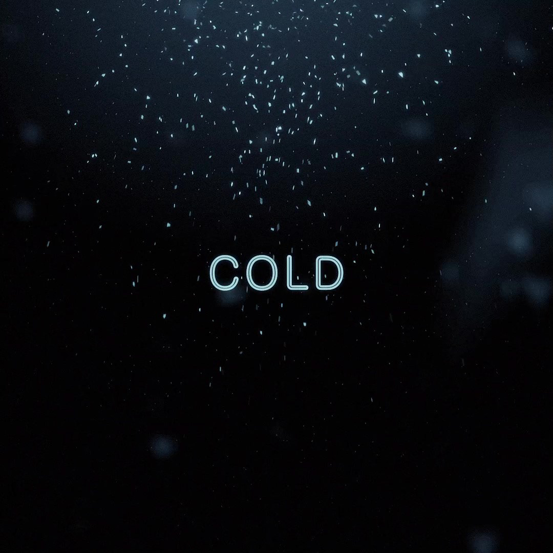
This was my entry to a challenge among the alumni at http://www.schoolofmotion.com. Topic: Opposites.

